
3 Days to Under 5 Minutes: Simplifying Announcement Banners
A three-system, two-person process for putting a banner at the top of an app. This is the story of how it got down to under five minutes, including the prototype that ended up doing more convincing than the wireframes did.
Overview
Announcement banners are the promo strips you see at the top of Compass Digital's ordering apps, Boost and Thrive: same-day deals, service outages, loyalty pushes, "we're closed for the holiday" notices. Small piece of UI, big job. It's one of the most visible things operators and marketing touch in the whole platform.
I led design on rebuilding how these get made, working with Phoebe and Claire from Marketing and Compass Digital's dev team. What started as "let's clean up banner creation" turned into a full rethink of who gets to touch what, and a pivot partway through that changed the whole shape of the build.
The problem
A single banner took 2-3 business days to go live, and marketing had to personally touch every one of them, no matter how small.
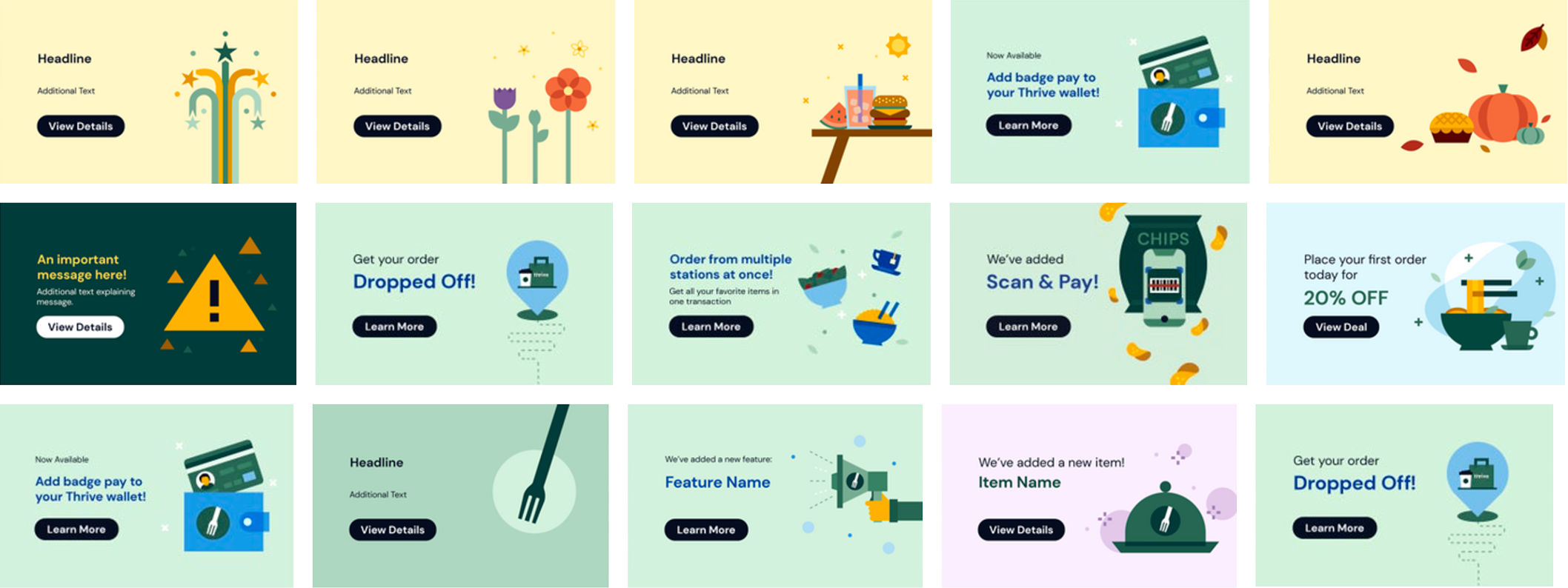
Here's how that happened. Originally, operators made their own banners: picked their own images, wrote their own text, hit publish. Predictably, that went sideways. Wrong sizing, watermarked stock photos, text baked into images so small you couldn't read it, accessibility problems all over. So marketing did the reasonable thing and locked it down: a gated template library (Brand Folder) plus an intake form. Operators would request a banner, and marketing would build it.
Which solved the quality problem and created a new one. Now every single banner, even the boring, obvious ones, required marketing to re-enter the operator's request by hand, hunt for or build new creative if nothing fit, and then manually deep-link it through a third tool called Adjust. Three systems, two people, and marketing sitting in the middle of every request whether it needed them or not. If a site had an outage on a Saturday, too bad. Someone was waiting 2-3 days for a banner telling guests the kitchen was down.
Discovery and Research
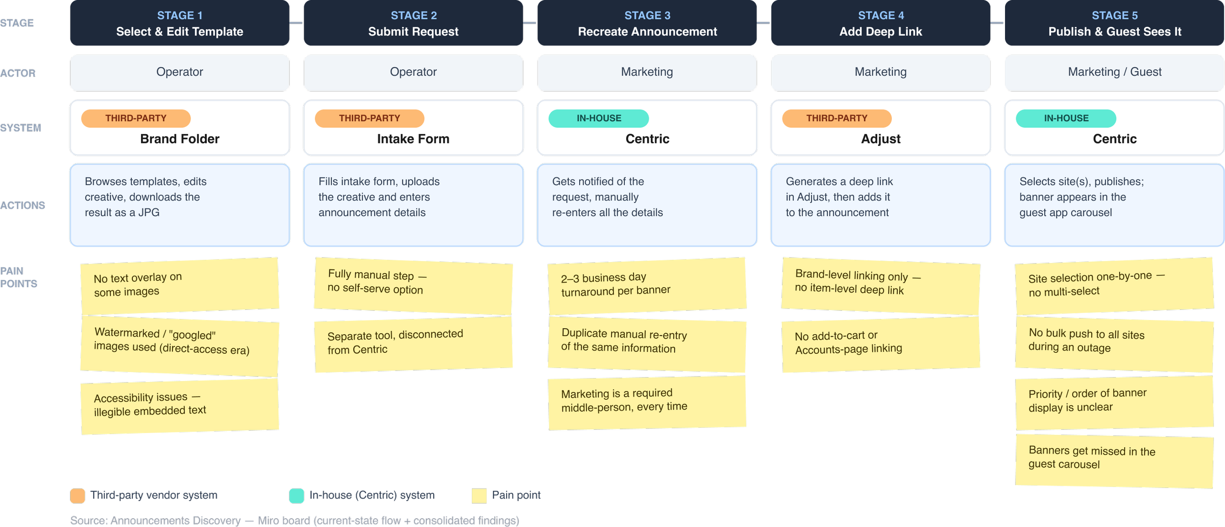
I sat down with marketing (Phoebe, Claire) and a handful of operators (Chris, Marc, Charles) and walked the whole thing end to end, from the moment an operator decides they need a banner to the moment a guest actually sees it.
Journey map
Two things became obvious once it was all on one map that weren't obvious when everyone was just complaining about their own piece of it. First, most of this process didn't even live in Centric, the tool operators and marketing actually work in day to day. It lived in the gaps between three separate systems. Second, all the individual complaints people had ("this takes too long," "I have to ask marketing for everything," "I can't find a decent image") were really one problem wearing different hats: nobody owned a single source of truth.
Who’s affected
Two people were carrying this, and neither was well served by it
The Operator
wants to tell guests something, a promo, a closure, an outage, right now. Instead they file a request, wait, and hope marketing gets to it before the moment's passed.

Marketing
owns the brand, and rightly so. But that means every banner, no matter how routine, needs their hands on it: checking the request, rebuilding it, sourcing an image, adding the link. They're not doing marketing. They're doing data entry.
Pain Points - Current Announcement System
What we found
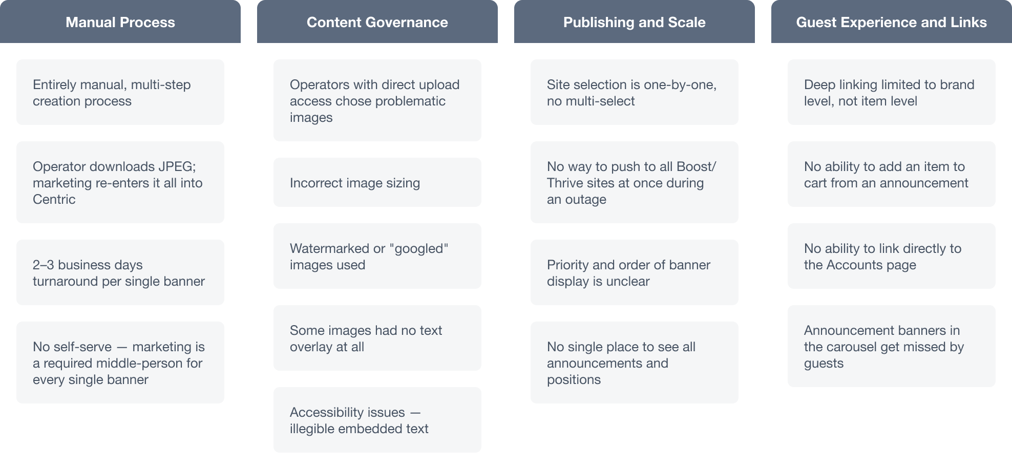
Once I dug into the interface itself, not just the workflow around it, the pain sorted into four buckets:
Manual Process
Banner creation had no self-serve path; marketing was a required middle-person for every request, and a single banner took 2–3 business days.
Publishing & scale
Site selection was one-by-one with no multi-select, there was no way to push an announcement to all sites at once during an outage, and there was no single place to see all live announcements or their display order.
Content governance
The very problem Brand Folder was introduced to solve (incorrect sizing, watermarked images, illegible text, accessibility gaps) still surfaced whenever operators had any direct image access.
Guest experience & linking
Deep links only worked at the brand level, not the item level, and banners were frequently missed in the guest app's carousel.
Reviewing the live interface alongside these findings surfaced additional interface-level friction that the workflow map alone didn't capture
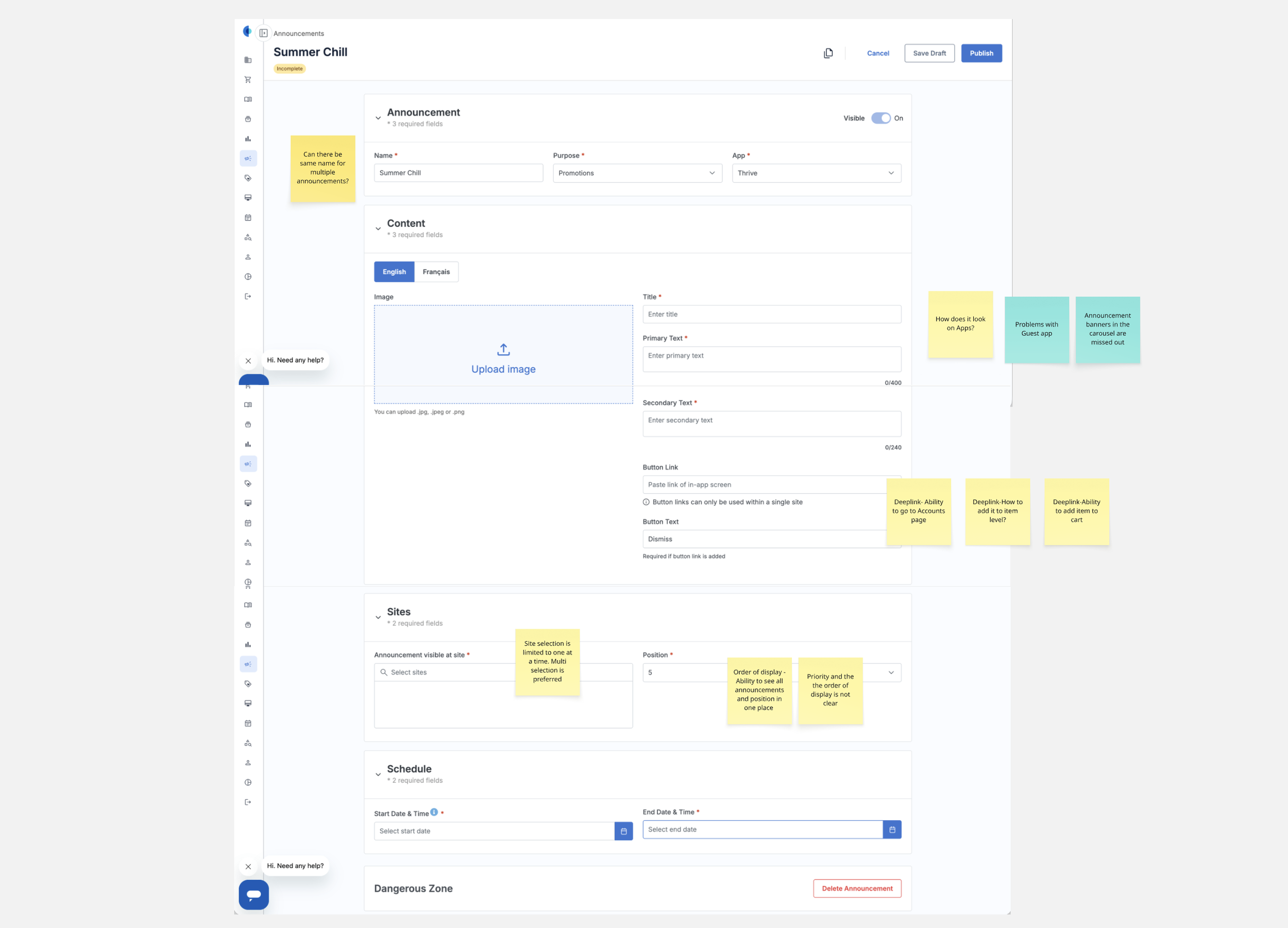
Defining the Solution (v1)
Self serve task flow
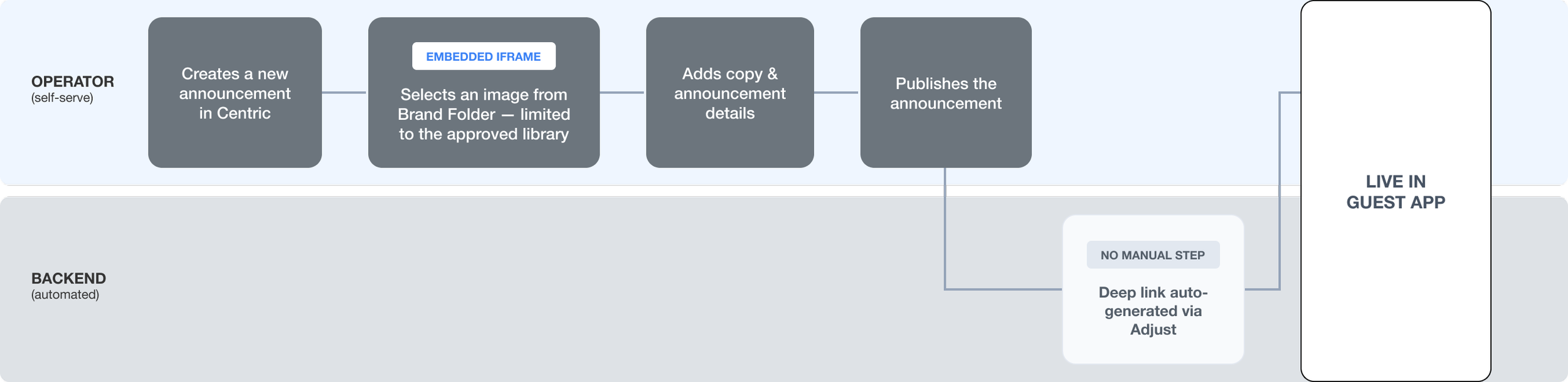
The first direction I proposed was to let operators self-serve without giving up brand control: embed Brand Folder directly inside Centric via an iFrame, so an operator could pick a pre-approved template and publish without ever filing a request. Marketing stays the gatekeeper of what's in the library, not a checkpoint on every banner that comes out of it. Deep linking moves into the backend, generated automatically, invisible to everyone.
I flagged it as something worth spiking before we committed to it, and the dev team went and tested it. Their finding: technically doable, but it would take longer to build and maintain than it was worth. Fair enough. That's exactly the kind of thing a spike is supposed to catch before it's baked into forty screens of wireframes.
The Pivot
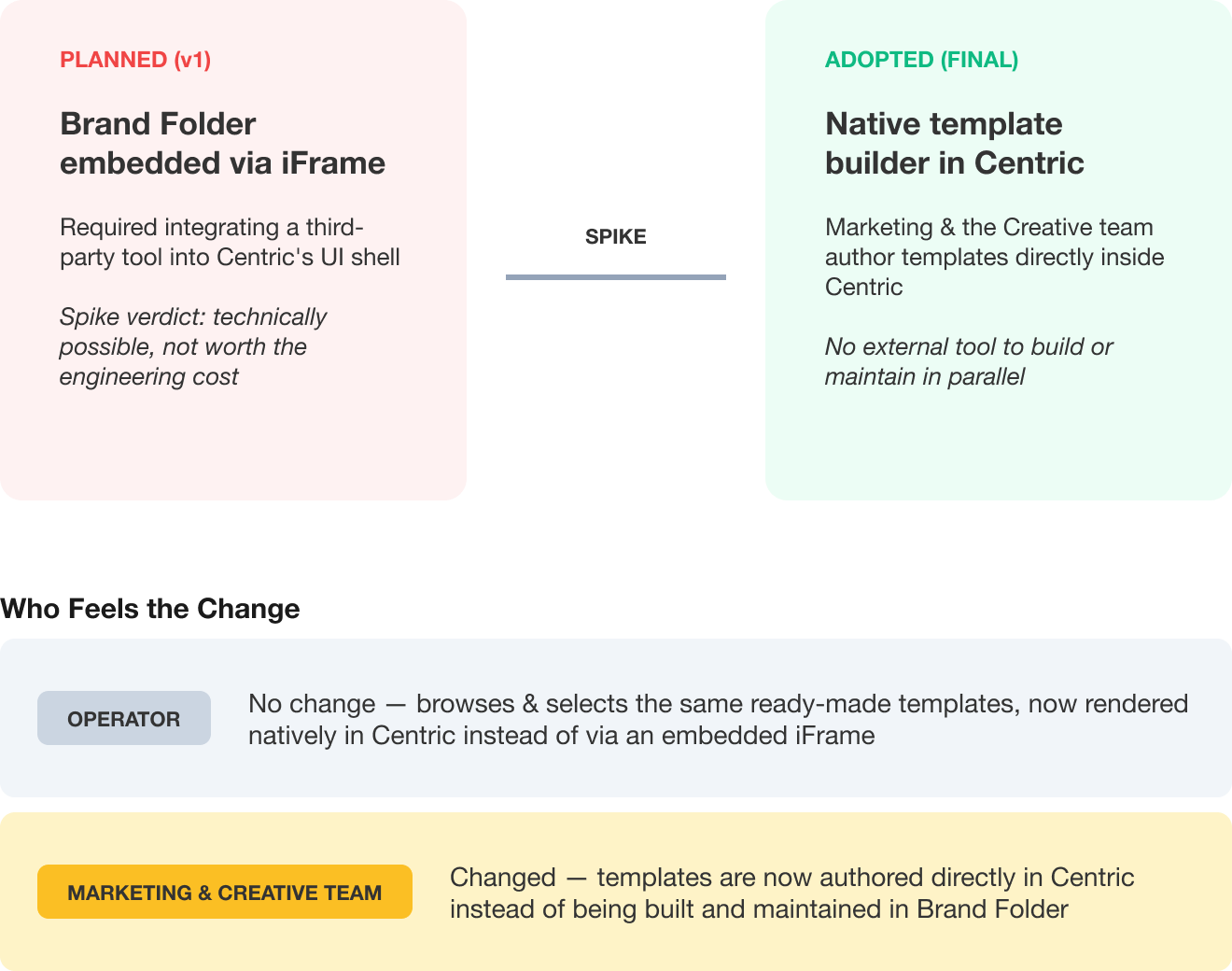
Rather than leave it there as a "well, that direction's dead" moment, I wanted to show, not just describe, what the alternative could look like. I used Claude to build out the actual banner creation flow myself: a standalone HTML file, working end to end, done in a single day. It wasn't production code, but it was real enough to click through, and that mattered. Handing the dev team something they could actually interact with, instead of a slide deck making the case, gave them the confidence to commit to building template creation natively inside Centric rather than trying to make the iFrame idea work.
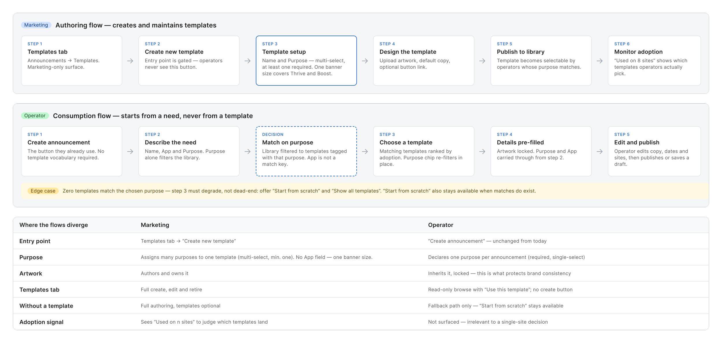
What operators actually feel
Here's the thing about that pivot: for operators, almost nothing changed. They still browse a library of ready-made templates and pick one. The only difference is that library now lives natively inside Centric instead of behind an embedded frame from another tool.
The real shift landed on marketing's side. Instead of building templates in Brand Folder, they now build them directly in Centric: laying out the background creative, placing text fields, and deciding exactly which fields an operator is allowed to touch. Everything else (layout, brand colors, button styling) is locked. Not locked by a style guide operators are supposed to follow. Locked by the software. There's no version of this where an operator accidentally recreates the watermarked-stock-photo problem, because there's no field for a photo to go in unless marketing put one there.
One decision worth flagging: a published banner is a snapshot. If marketing later edits the template it came from, the already-live banner doesn't change retroactively. We surfaced this directly in the interface rather than letting anyone discover it the hard way, because "why did my live banner change out from under me" is not a conversation anyone wants to have mid-outage.
Wireframes
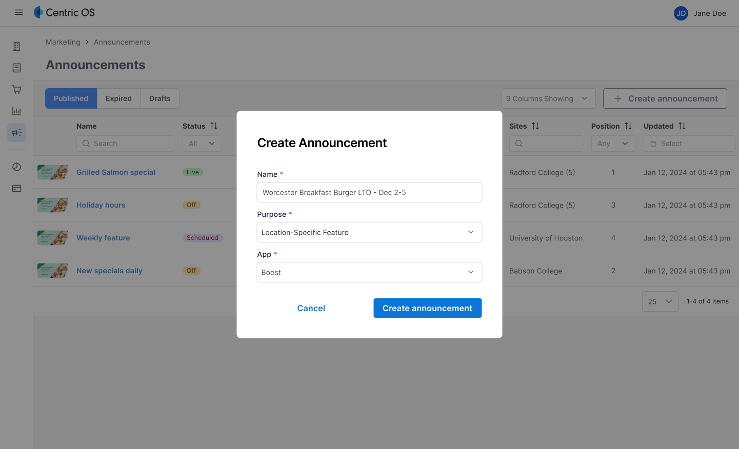
Step 1 - Create announcement
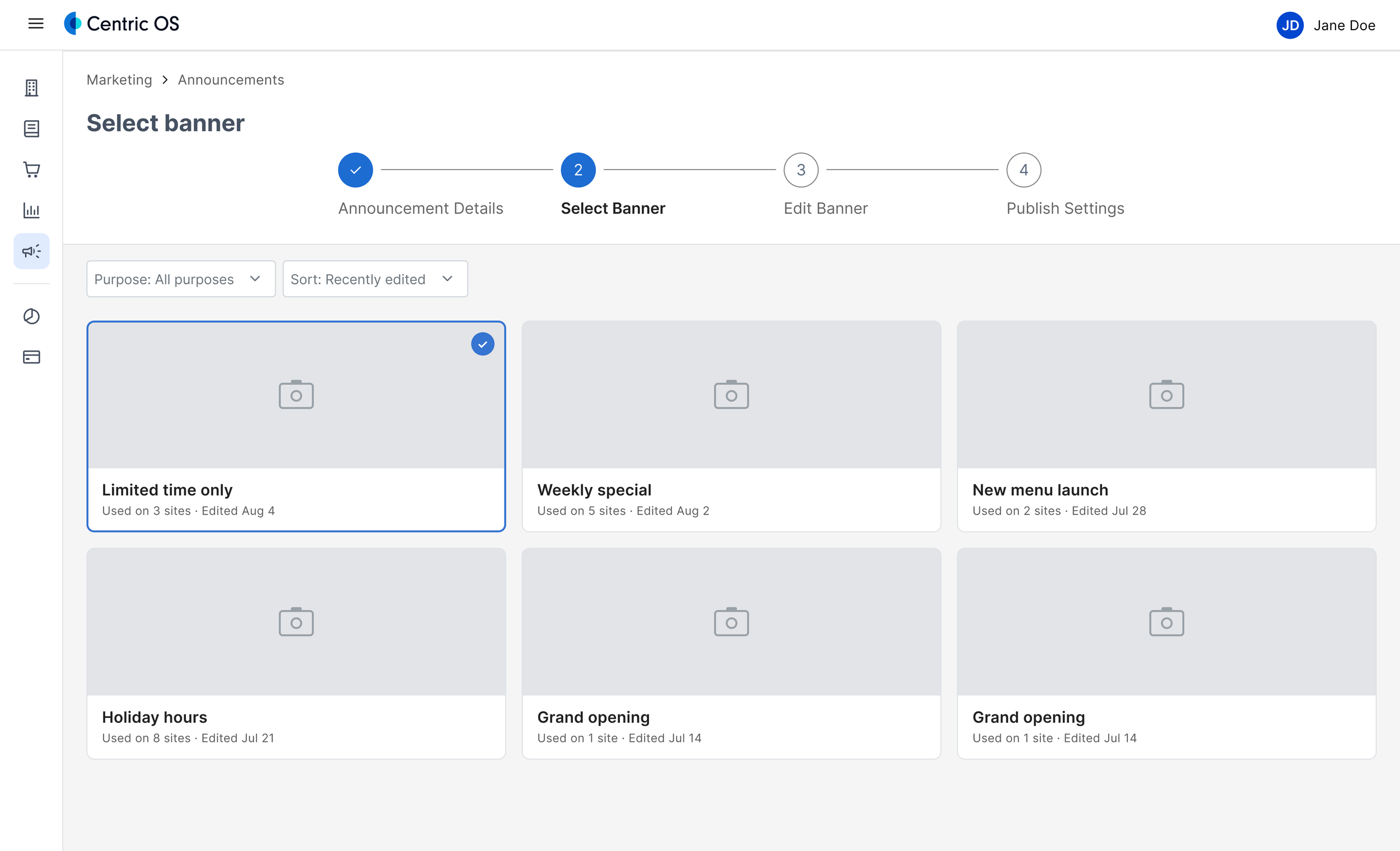
Step 1 - Select the template for the banner
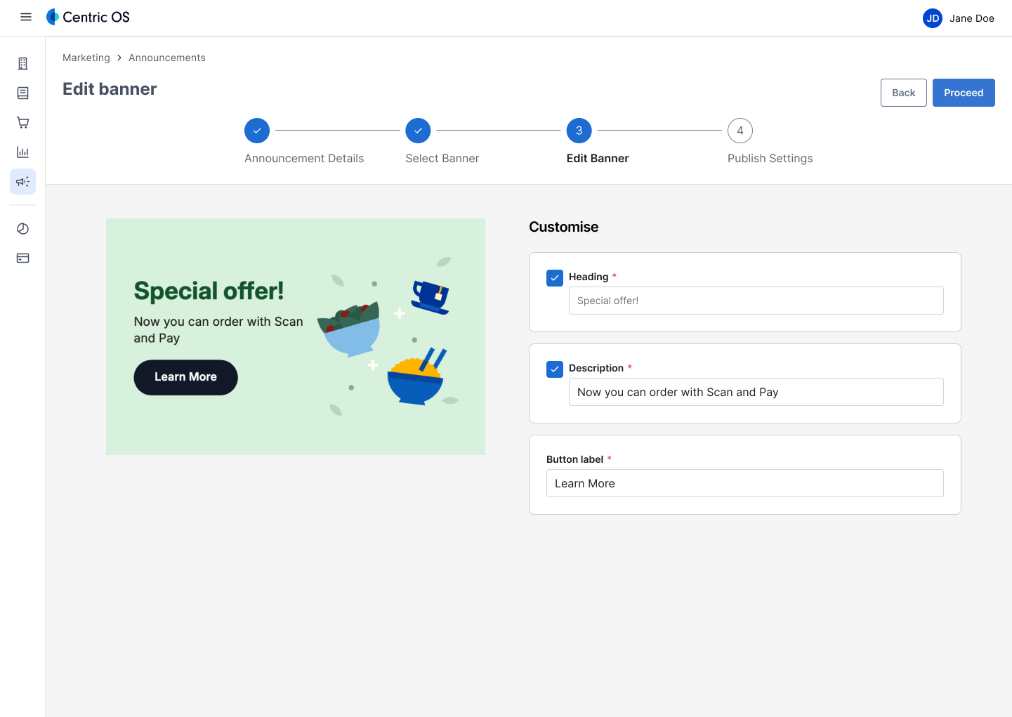
Edit the banner with promotion details
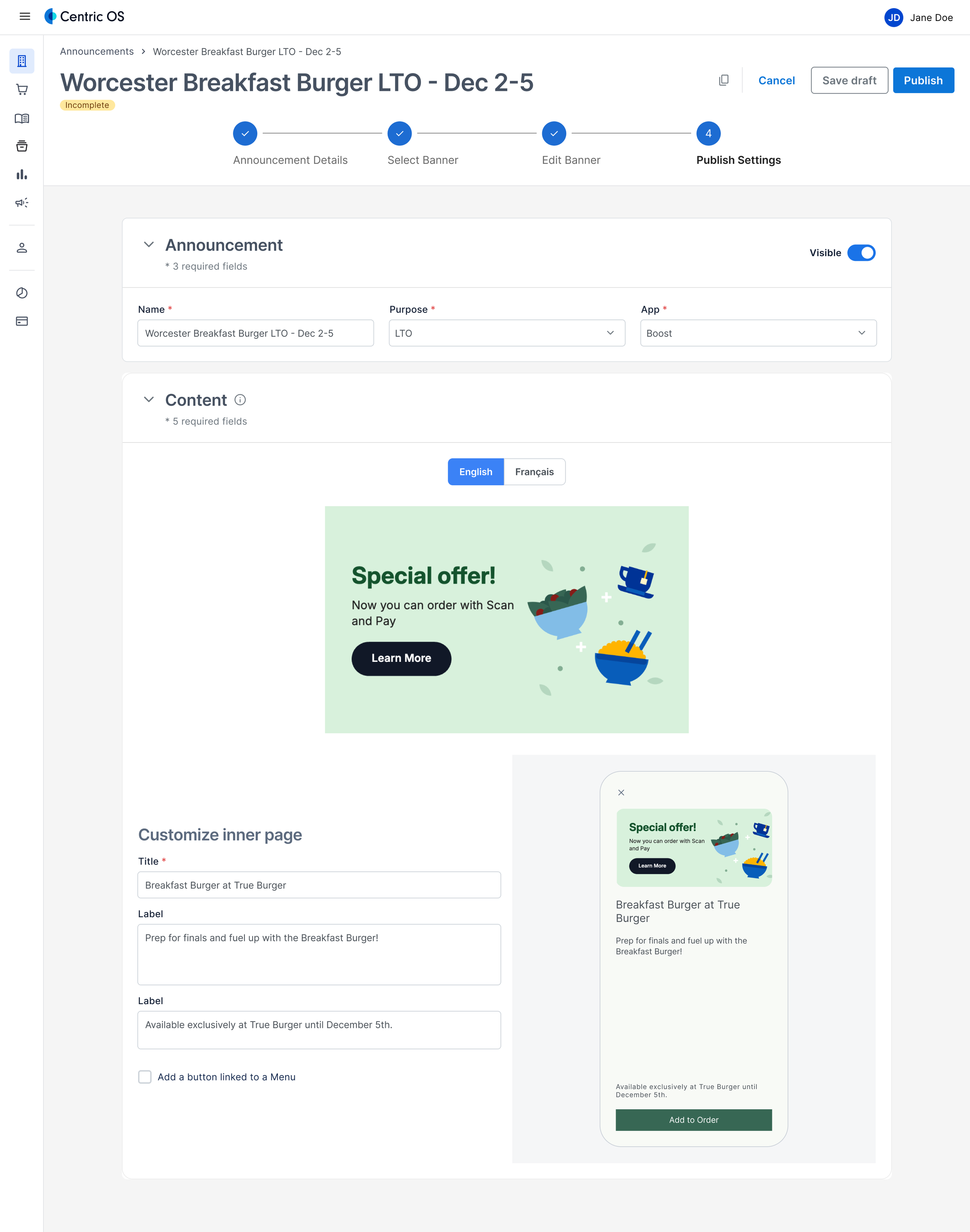
Add details for publishing
Marketing team can create a new template in Centric
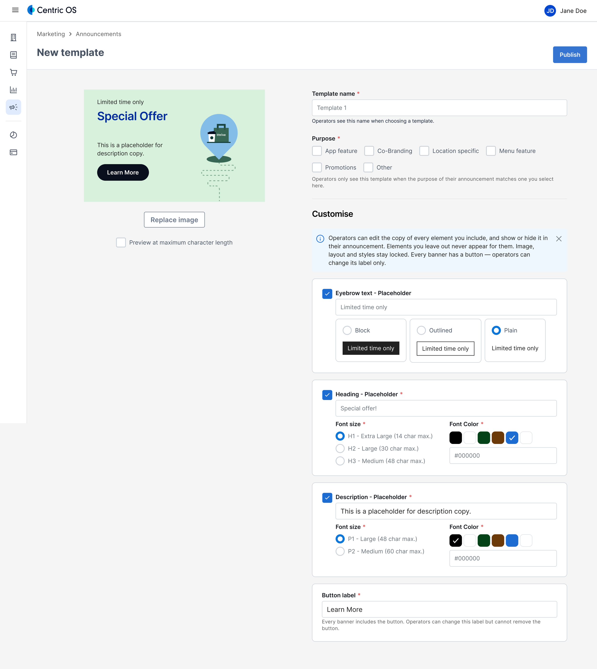
Where it landed
An operator now opens Centric, picks a template, fills in the two or three fields marketing exposed (headline, body, maybe a CTA), and publishes. No request. No waiting on marketing. No possible way to introduce the inconsistencies that started this whole project in the first place, because the guardrails are structural now, not procedural.
Banner creation went from 2-3 business days across three systems to under 5 minutes in one. And marketing's job changed shape: instead of being a mandatory checkpoint on every single banner published, they own the templates, a much smaller surface, and one that scales with how many templates exist, not how many banners go out.